Abandoned Browse
Unlock the full revenue potential of browse
Go beyond the basic browse message and incorporate more customer data to deliver an exceptional customer experience and increase revenue.
Are you maximizing the potential of all your existing customer data?
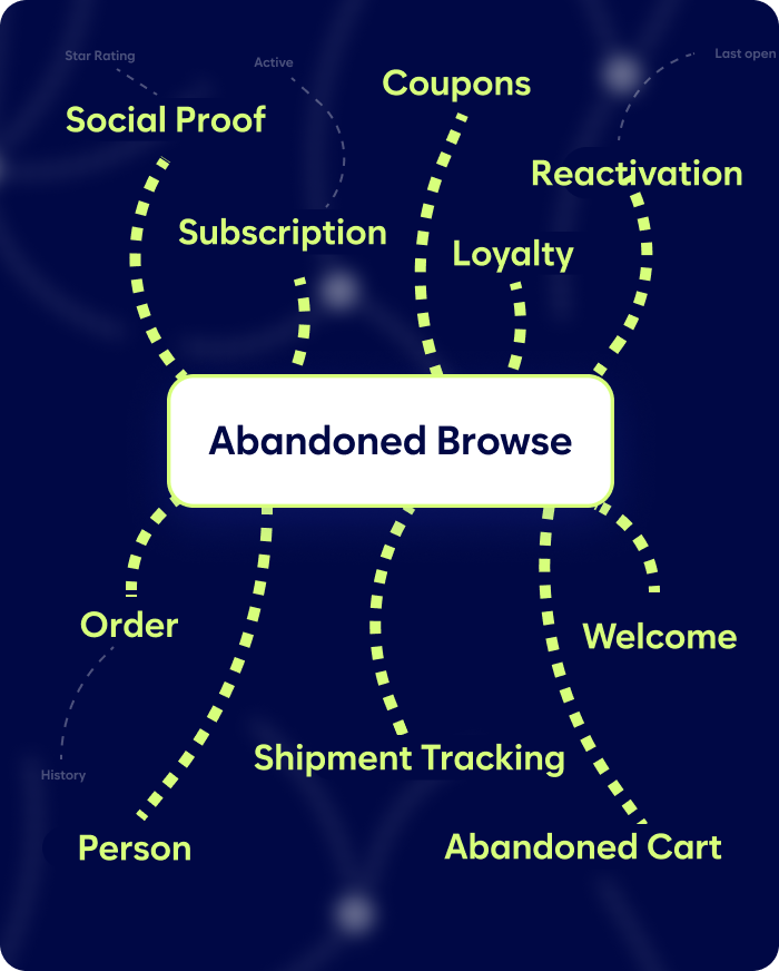
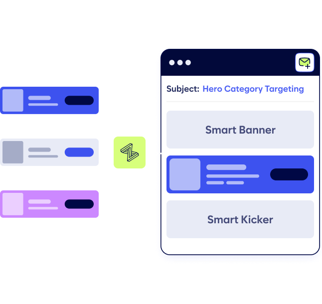
Create multi-dimensional banners that drive significant revenue lift
Apply welcome discounts to abandoned browse and increase conversion rates 2-3x from a standard browse message.
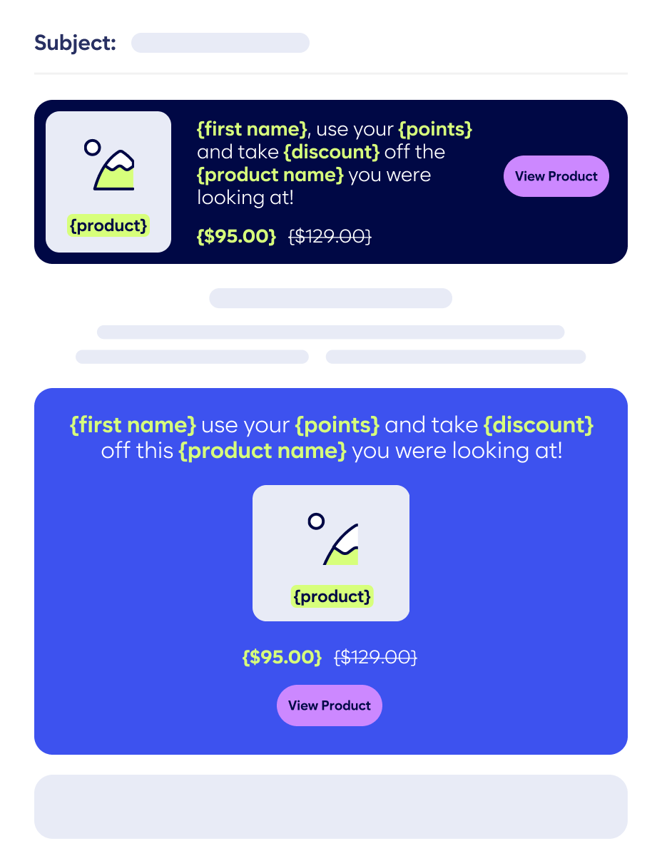
Show loyalty status and points applied to the abandoned browse message and increase conversions 2-3x over a standard browse message.
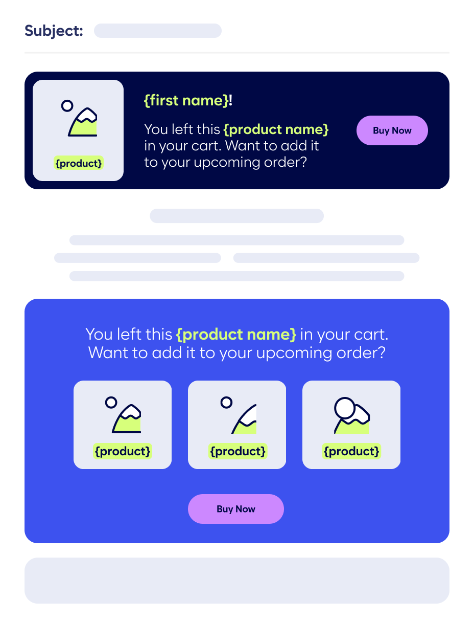
Upsell abandoned browse by promoting subscription to products that customers have previously purchased that they recently browsed.
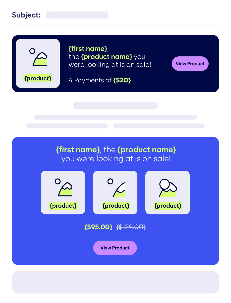
Increase the conversion rate of your abandoned browse message by showing the price when broken out into 4 payments with Klarna, Affirm, or other BNPL providers.
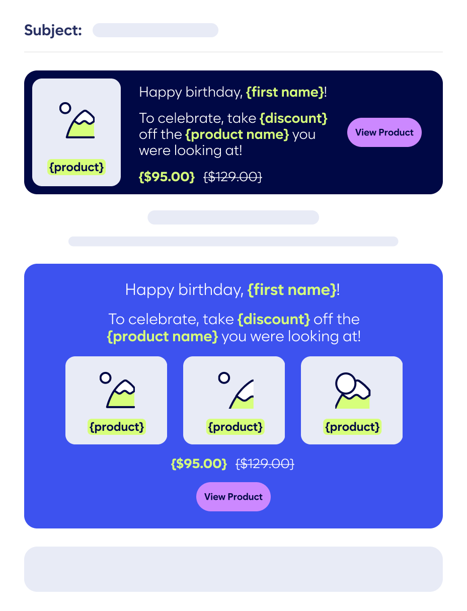
Increase abandoned browse conversions by applying the birthday discount to the browsed item and increase conversions 2-3x over a standard browse banner.
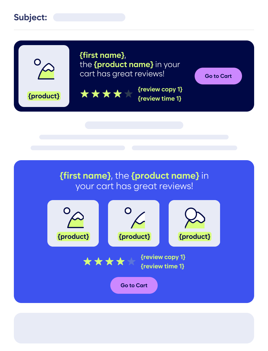
Build trust with animated and rotating reviews to provide social proof for browsed products to increase conversion rates.
Work with Zembula’s team of experts to create new and unique data combinations that perform with your audience.


Why is Zembula perfect for your daily email personalization?
Book a DemoThe long-tail of combining customer data and design in unique ways drives 65% of your total revenue lift with Zembula Dimensions™. Our composition engine makes it quick and easy to create this long tail of use cases, along with providing the decision engine to always pick and personalized the perfect use case for every consumer in every unique moment.
The customer data you’ve worked so hard to collect is best leveraged to deliver the long-tail of personalization in your daily email. Why? Because your daily email is the heartbeat of your marketing program, and it’s the most likely email to be opened when a consumer looks at their inbox. If you have exactly the right personalization in every one of those emails, consumers will reward you by spending more.
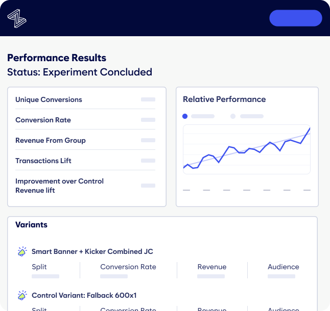
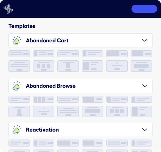
It’s as simple as dropping an image at the top and bottom of your master email template. Once the images are placed, you never have to touch them again. Zembula dynamically picks from hundreds of use cases to display the perfect personalized experience in every open, and you can add additional use cases any time without updating the html in your email template.
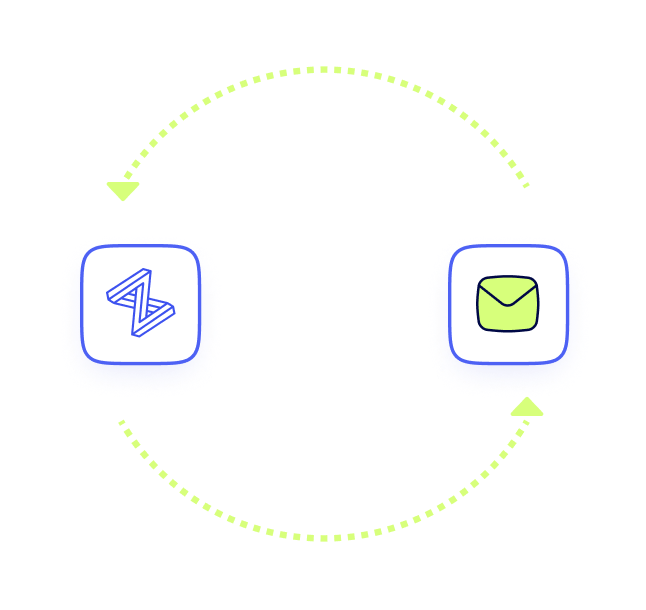
Once you’ve dropped the Zembula image at the top and bottom of your daily email’s master template, you’re set. You won’t have to change anything or manage anything on a daily basis. It’s also easy to add and test in new use cases, which can all be done within the Zembula platform without having to update your email HTML.
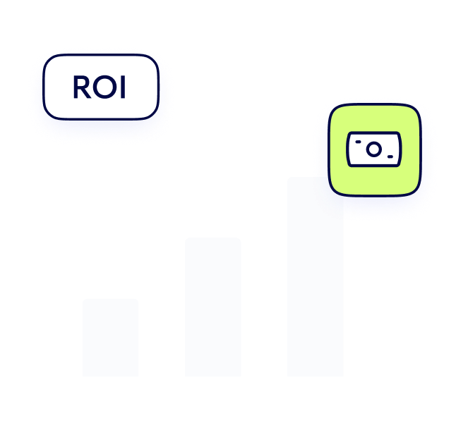
Across all our enterprise retail customers, Zembula consistently delivers at least 11x return on spend. You’ve invested a lot in collecting valuable customer data, and Zembula provides the solution you need to maximize the revenue return on that data.


Zembula is built for daily email personalization at scale
Our Composition Engine makes it easy to deliver the ultimate daily email experience that’s fully automated and leverages all your customer data to optimize revenue and customer loyalty.
“We are pleased with our results and were able to get an 11x ROAS with Zembula. In addition to an amazing return, Zembula is easy to use and quick to get started with.”
Easily integrate with your existing data feeds
Minimize the effort required by your IT team, and direct your existing feeds to Zembula.
We transform, normalize and combine data, making it easy to design with.

More solutions
Unlock even more growth. Zembula offers advanced features beyond personalization.
Increase the visibility of your loyalty program and integrate loyalty with the rest of your customer data to create richer customer experience and a more loyal customer.
Improve the customer experience of waiting for a shipment and simultaneously improve the 2nd and 3rd purchase rates.
Increase the visibility and fidelity of one of your best performing customer events.
Turn repeat purchasers into subscribers of the products they can’t live without and create a more predictable revenue stream.
Implementation is fast and easy
We’re experienced working with enterprise customers who have limited resources and we will help you get up and running in under 6 weeks. We do all the work, and you provide feedback and approve it.
- Data mapping and discovery
- Data connections
- Creative development
- Content build out
- Platform QA & testing
- Email QA testing
- Acceptance
- Launch
- Scheduled check-ins
Resources and insights
FAQ’s
Looking for help?
Here are our most frequently asked questions.
No, you want to make sure you take full advantage of the customer data you have and display the best converting banner a subscriber qualifies to see. You also want to create different versions of the banner to rotate through in the daily email to keep your content fresh.
It’s fast. We provide you with templates and our design team will take a first pass at designing the banners. We then hand the banners off to you and your team to review them and provide feedback. This can all be completed within a week or two along with all the other use cases and banners we will be creating for you.
We pick the easiest way given your unique data setup. Sometimes that’s using our free website snippet and mobile SKD. Other times you may be using solutions you already have like mParticle that we easily integrate with to get the data. We have lots of options so we can make it as easy as possible for your IT team.
Grow your revenue and customer loyalty


